
Website Development Mistakes to Avoid in 2025

Imagine spending months building a website, investing your time, effort, and money—only to see it fail. No visitors. No conversions. Just a slow, clunky, outdated site that no one wants to use. Sounds like a nightmare, right?
Well, here’s the harsh truth, website development is evolving fast, and if you don’t keep up, your website might just become irrelevant. In 2025, Google is stricter, users are more impatient, and competition is fiercer than ever. Your audience will bounce like a rubber ball if you make one mistake.
We have you covered, though, so don’t worry! To maintain your website functioning like a well-oiled machine in 2025, let’s examine the most common mistakes made in website building and offer workable solutions.
Most common web development mistakes that should avoid
- Pick wrong CMS
Since every web designer has experience with a different CMS, you cannot expect a web designer to come in a bundle. And since they can work faster when they are adept with a single CMS, there is nothing wrong with that.
Employing a web designer who is proficient in all CMS platforms and other platforms is something that firms realise. A skilled web designer that is passionate about what they do can provide distinct, or even better, outcomes. They can also help you save money and time. Finding the correct audience is nearly impossible, and there is a chance that website maintenance will go wrong. Do your research to make sure the designer is the best fit for your company’s website platform before putting your entire faith in them.
- Avoid security measure
 ,
,Neglecting security measures for your website can lead to significant risks. Cyberattacks are on the rise, with over 30,000 websites being hacked daily. When a site is hacked, it can lose customer trust, get blacklisted by search engines, or even face shutdowns.
To prevent such issues, ensure your website always uses HTTPS with an SSL certificate. Keep all plugins and themes updated to avoid vulnerabilities that hackers exploit. Utilise security plugins like Word fence or Sucuri and enforce strong passwords to enhance security. A secure website not only builds trust with visitors but also safeguards your business from potential harm.
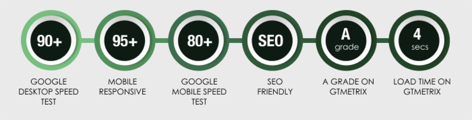
- Slow loading website
Minimise HTTP requests by reducing unnecessary CSS, JavaScript, and fonts. Use a Content Delivery Network (CDN) to ensure faster global access. Enable caching to store data and improve return visits. Run your site through Google Page Speed Insights and fix any issues for better performance!
- Bad UX/ UI
Choose readable fonts and colours; avoid hard-to-read combinations like neon green on black. Ensure accessibility by using alt text for images, keyboard navigation, and contrast-friendly colours. A smooth, user-friendly design keeps visitors engaged and improves conversions.
- Neglecting accessibility
All interactive components should be, so far as possible, accessible via keyboard inputs in order to help reveal possible access problems. Compliance with the laws, but mostly accessibility, creates a more open and inviting web experience.
- Unclear CTA’s
A key part of landing pages with high conversion rates is a call to action. Concentrate on three essential components when creating CTAs: messaging, positioning, and visual design.
To attract attention, your CTAs need to be visually striking. Use contrasting colours to make buttons stand out and use the right hover effects to make them appear clickable. Particularly on mobile devices, where they must be tap-friendly, the size should be large enough to be clear without being overpowering.
- Poor Typography
Keep the contrast between the colours of your text and background as high as possible to maximise legibility. Although pure black on pure white can strain the eyes, dark text on light backgrounds (or vice versa) works best. To construct easily digestible content chunks, utilise paragraph breaks and appropriate line spacing (1.5 to 2 times your font size).
- Poor quality images
Do your pictures make your website better or worse? Your content is accessed through high-quality photographs. A website that uses generic stock photographs may come out as unauthentic. Rather, make use of high-quality, pertinent graphics that complement your brand colours and closely relate to your content. High-end firms often employ professional, high-resolution photos to successfully present their products, producing a powerful visual impact that resonates with their target audience.
- Ignore SEO Basics
Keep in mind that search engines have limits when using contemporary design elements like infinite scroll. Since Google cannot efficiently crawl endlessly scrolling pages, you may want to use “Load More” buttons or pagination. Each page of your website should have strong, original content rather than thin or repetitive information, and it should be organised with logical internal linking between key parts.
Conclusion
Being a top website development company, DigitilizeWeb understands that avoiding these typical mistakes is important for achieving quantifiable business outcomes rather than merely being aesthetically pleasing. We’ve personally witnessed how fixing problems like sluggish load times and unresponsive design can greatly increase conversion rates.It is now vital to invest in data-driven optimisation and user experience. In today’s digital world, it is essential. At DigitilizeWeb, we place a high value on building websites that are both aesthetically pleasing and incredibly functional so that your online presence can effectively support your growth goals.